
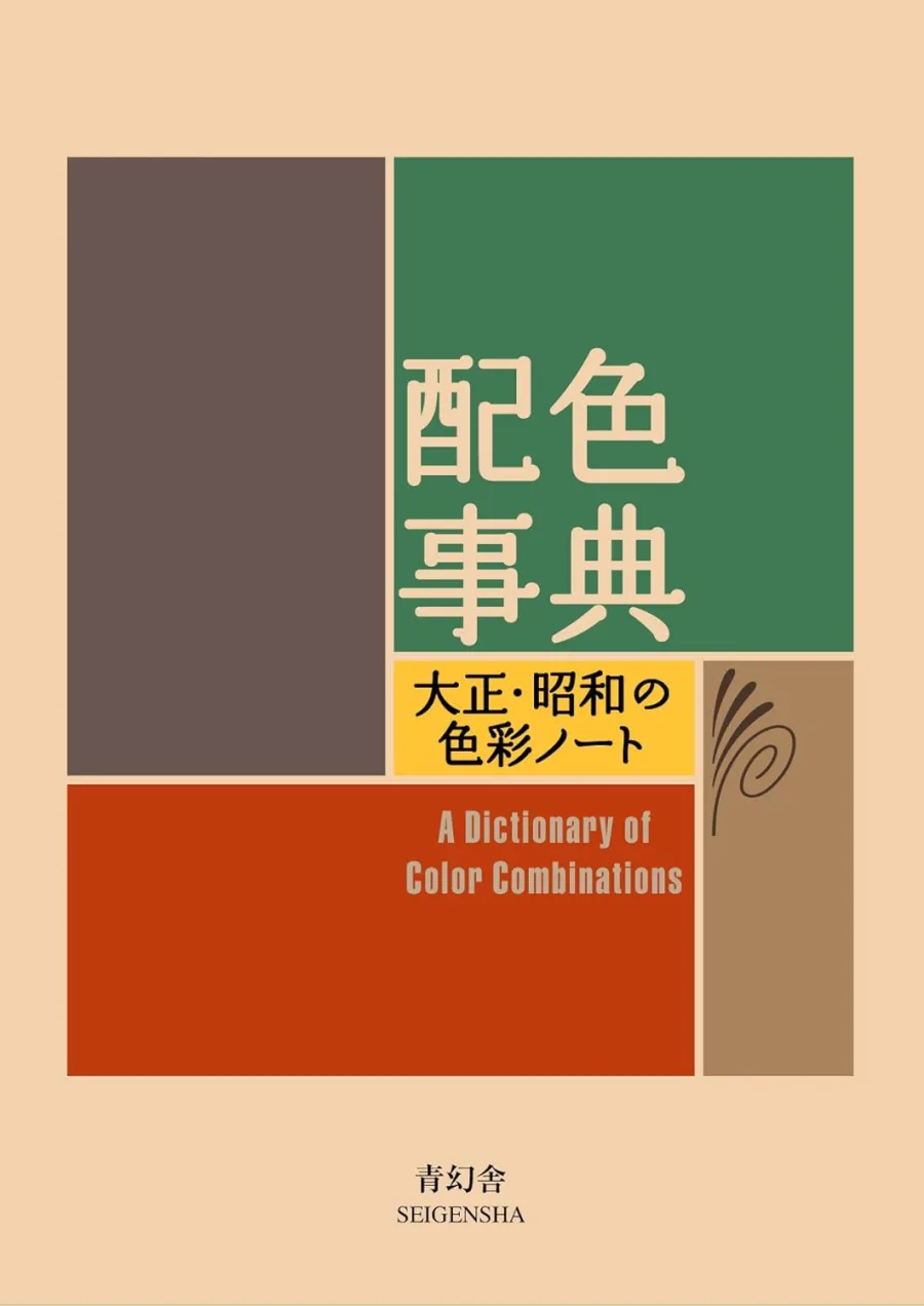
A Dictionary Of Color Combinations Vol 1 (Japanese Edition)
Paperback
• 256 Pages
• USD 27.00
• Japanese
• 9784861522475
No ratings yet
| Publisher | Seigensha |
|---|---|
| ISBN13 | 9784861522475 |
| ASIN/SKU | 4861522471 |
| Book Format | Paperback |
| Language | Japanese |
| Pages | 256 |
| List Price | USD 27.00 |
| Publishing Date | 31/12/2010 |
| Dimensions | 5.87 x 0.67 x 4.29 inches |
| Weight | 8.3 ounces |
| Book Code | BD00067212 |
Buy this Book
Amazon Stores
Ebook Stores
Other Stores
Discover A Dictionary Of Color Combinations Vol 1 (Japanese Edition) by Various. This book is published by Seigensha in Paperback format, ISBN 9784861522475, ASIN 4861522471, under Reference, Graphic Design.
Book Description
Sanzo Wada (1883-1967) was an artist, teacher, costume and kimono designer during a turbulent time in avant-garde Japanese art and cinema. Wada was ahead of his time in developing traditional and Western influenced colour combinations, helping to lay the foundations for contemporary colour research. Based on his original 6-volume work from the 1930s, this book offers 348 color combinations, as attractive and sensuous as the books own design.
Author Biography
Author Biography will be added soon…
Editorial Reviews
Editorial Reviews will be added soon…
Book Summary
A Dictionary of Color Combinations Vol. 1 (Japanese Edition) is a beautifully curated reference book that showcases hundreds of carefully selected color palettes inspired by the rich tradition of Japanese design and aesthetics. Originally based on historical color research, the book is not a conventional narrative with characters or a plot. Instead, it serves as an inspiring visual guide for artists, designers, illustrators, fashion professionals, interior decorators, and anyone interested in understanding how colors work together. Through its thoughtfully organized collection of color combinations, the book demonstrates how harmony, balance, and contrast can be achieved using carefully chosen shades.
The book introduces readers to the fascinating world of color by presenting combinations that have been admired in Japanese culture for generations. Rather than explaining color theory through lengthy discussions, it allows readers to learn visually. Each page features coordinated palettes that highlight how individual colors can complement one another, creating moods that range from calm and elegant to bold and energetic. By studying these combinations, readers gain a deeper appreciation for the emotional and artistic impact that colors can have when they are used thoughtfully.
One of the book's defining features is its connection to traditional Japanese color culture. Many of the colors included in the collection have historical significance and were inspired by nature, seasonal landscapes, textiles, ceramics, architecture, and classical art. Soft shades of cherry blossom pink, deep indigo blues, earthy browns, bamboo greens, rich crimson reds, and delicate creams reflect the natural beauty that has long influenced Japanese design. These colors are not presented merely as individual shades but as harmonious groups that reveal how they interact with one another.
Each color combination is carefully arranged to show the relationship between multiple colors rather than focusing on a single dominant hue. Readers can observe how warm and cool colors balance each other, how muted tones create sophistication, and how contrasting shades generate visual excitement. This practical presentation allows designers and artists to quickly identify palettes that suit a particular project or creative vision without needing extensive technical knowledge of color theory.
Although the book contains very little descriptive text, every page communicates ideas through visual organization. The carefully designed layouts encourage readers to compare different palettes and notice subtle variations in brightness, saturation, and tone. Some combinations evoke the peaceful atmosphere of a quiet garden, while others capture the vibrancy of festivals, traditional clothing, or changing seasons. These visual examples demonstrate that color is not only decorative but also capable of expressing emotion, culture, and atmosphere.
The collection emphasizes the importance of balance. Rather than relying on loud or overwhelming contrasts, many of the featured palettes use restraint and subtle transitions between colors. This reflects a central aspect of Japanese aesthetics, where beauty is often found in simplicity, harmony, and understated elegance. Readers learn that effective color design does not always require bright or dramatic combinations. Sometimes the most memorable palettes are those that blend gentle shades with careful precision.
The book is particularly valuable for creative professionals seeking inspiration. Graphic designers can use the palettes when developing branding materials or illustrations. Fashion designers may discover combinations suitable for clothing collections, while interior designers can adapt the harmonious color schemes to create comfortable living spaces. Artists and photographers can also use the book to explore fresh ideas for composition and mood. Because the palettes are versatile, they can be applied across a wide variety of creative disciplines.
Beyond its practical applications, the book encourages readers to become more observant of the colors that surround them in everyday life. It highlights the idea that meaningful color combinations often exist naturally in landscapes, flowers, skies, forests, and changing seasons. By studying these carefully selected palettes, readers begin to notice similar harmonies in the world around them, strengthening both their appreciation for nature and their artistic awareness.
Another strength of the book lies in its accessibility. Unlike technical textbooks filled with complex terminology and scientific explanations, *A Dictionary of Color Combinations Vol. 1* communicates almost entirely through visual examples. Readers do not need formal training in design to benefit from its contents. Beginners can simply browse the pages for inspiration, while experienced professionals can analyze the subtle relationships between colors in greater depth. This universal approach has contributed to the book's popularity among creative people around the world.
The collection also demonstrates how cultural traditions can influence artistic choices. Many of the featured palettes reflect centuries of Japanese craftsmanship, where colors were carefully selected for kimono fabrics, lacquerware, ceramics, gardens, and architecture. These historical influences remind readers that color carries cultural meaning as well as visual appeal. Understanding these traditional combinations provides insight into how artistic preferences evolve while remaining connected to heritage.
Throughout the book, readers are encouraged to experiment rather than simply copy the featured palettes. The combinations serve as starting points for personal creativity, inspiring artists and designers to develop their own unique interpretations. By observing how different shades interact, readers gain confidence in making color choices and exploring combinations they might not have considered otherwise.
Despite being a reference guide rather than a traditional instructional manual, the book quietly teaches several important principles of design. It demonstrates how contrast can draw attention, how repetition creates unity, and how carefully balanced colors contribute to an overall sense of harmony. These lessons emerge naturally through repeated exposure to thoughtfully curated examples rather than formal instruction, making the learning process enjoyable and intuitive.
Overall, A Dictionary of Color Combinations Vol. 1 (Japanese Edition) is a timeless resource that celebrates the beauty, versatility, and emotional power of color. Through its elegant presentation of hundreds of harmonious palettes, it offers both inspiration and practical guidance for artists, designers, and creative thinkers. More than simply displaying attractive colors, the book invites readers to appreciate the cultural traditions, natural influences, and artistic principles that shape successful color design. Its enduring appeal lies in its ability to transform the simple act of choosing colors into a thoughtful and inspiring creative experience, making it an invaluable companion for anyone interested in visual art and design.
The book introduces readers to the fascinating world of color by presenting combinations that have been admired in Japanese culture for generations. Rather than explaining color theory through lengthy discussions, it allows readers to learn visually. Each page features coordinated palettes that highlight how individual colors can complement one another, creating moods that range from calm and elegant to bold and energetic. By studying these combinations, readers gain a deeper appreciation for the emotional and artistic impact that colors can have when they are used thoughtfully.
One of the book's defining features is its connection to traditional Japanese color culture. Many of the colors included in the collection have historical significance and were inspired by nature, seasonal landscapes, textiles, ceramics, architecture, and classical art. Soft shades of cherry blossom pink, deep indigo blues, earthy browns, bamboo greens, rich crimson reds, and delicate creams reflect the natural beauty that has long influenced Japanese design. These colors are not presented merely as individual shades but as harmonious groups that reveal how they interact with one another.
Each color combination is carefully arranged to show the relationship between multiple colors rather than focusing on a single dominant hue. Readers can observe how warm and cool colors balance each other, how muted tones create sophistication, and how contrasting shades generate visual excitement. This practical presentation allows designers and artists to quickly identify palettes that suit a particular project or creative vision without needing extensive technical knowledge of color theory.
Although the book contains very little descriptive text, every page communicates ideas through visual organization. The carefully designed layouts encourage readers to compare different palettes and notice subtle variations in brightness, saturation, and tone. Some combinations evoke the peaceful atmosphere of a quiet garden, while others capture the vibrancy of festivals, traditional clothing, or changing seasons. These visual examples demonstrate that color is not only decorative but also capable of expressing emotion, culture, and atmosphere.
The collection emphasizes the importance of balance. Rather than relying on loud or overwhelming contrasts, many of the featured palettes use restraint and subtle transitions between colors. This reflects a central aspect of Japanese aesthetics, where beauty is often found in simplicity, harmony, and understated elegance. Readers learn that effective color design does not always require bright or dramatic combinations. Sometimes the most memorable palettes are those that blend gentle shades with careful precision.
The book is particularly valuable for creative professionals seeking inspiration. Graphic designers can use the palettes when developing branding materials or illustrations. Fashion designers may discover combinations suitable for clothing collections, while interior designers can adapt the harmonious color schemes to create comfortable living spaces. Artists and photographers can also use the book to explore fresh ideas for composition and mood. Because the palettes are versatile, they can be applied across a wide variety of creative disciplines.
Beyond its practical applications, the book encourages readers to become more observant of the colors that surround them in everyday life. It highlights the idea that meaningful color combinations often exist naturally in landscapes, flowers, skies, forests, and changing seasons. By studying these carefully selected palettes, readers begin to notice similar harmonies in the world around them, strengthening both their appreciation for nature and their artistic awareness.
Another strength of the book lies in its accessibility. Unlike technical textbooks filled with complex terminology and scientific explanations, *A Dictionary of Color Combinations Vol. 1* communicates almost entirely through visual examples. Readers do not need formal training in design to benefit from its contents. Beginners can simply browse the pages for inspiration, while experienced professionals can analyze the subtle relationships between colors in greater depth. This universal approach has contributed to the book's popularity among creative people around the world.
The collection also demonstrates how cultural traditions can influence artistic choices. Many of the featured palettes reflect centuries of Japanese craftsmanship, where colors were carefully selected for kimono fabrics, lacquerware, ceramics, gardens, and architecture. These historical influences remind readers that color carries cultural meaning as well as visual appeal. Understanding these traditional combinations provides insight into how artistic preferences evolve while remaining connected to heritage.
Throughout the book, readers are encouraged to experiment rather than simply copy the featured palettes. The combinations serve as starting points for personal creativity, inspiring artists and designers to develop their own unique interpretations. By observing how different shades interact, readers gain confidence in making color choices and exploring combinations they might not have considered otherwise.
Despite being a reference guide rather than a traditional instructional manual, the book quietly teaches several important principles of design. It demonstrates how contrast can draw attention, how repetition creates unity, and how carefully balanced colors contribute to an overall sense of harmony. These lessons emerge naturally through repeated exposure to thoughtfully curated examples rather than formal instruction, making the learning process enjoyable and intuitive.
Overall, A Dictionary of Color Combinations Vol. 1 (Japanese Edition) is a timeless resource that celebrates the beauty, versatility, and emotional power of color. Through its elegant presentation of hundreds of harmonious palettes, it offers both inspiration and practical guidance for artists, designers, and creative thinkers. More than simply displaying attractive colors, the book invites readers to appreciate the cultural traditions, natural influences, and artistic principles that shape successful color design. Its enduring appeal lies in its ability to transform the simple act of choosing colors into a thoughtful and inspiring creative experience, making it an invaluable companion for anyone interested in visual art and design.
Sample Chapters
Sample Chapters will be added soon…
Reader Reviews
No reviews yet.
A Dictionary Of Color Combinations Vol 1 (Japanese Edition)
Download Cover Image
Do you want to download the full cover image for A Dictionary Of Color Combinations Vol 1 (Japanese Edition)?